(Disclaimer: I am not affiliated with the show The Walking Dead nor with AMC)
The first time is saw the new poster for “The Walking Dead”, a series on AMC, i stopped and stared for a moment, it was so powerful, why was it so familiar? I do not watch the show nor have i read the comic that it is based on, so i am not familiar with the story line other than that it is about zombies. The poster for season 2 is truly beautiful, it is simplicity at its finest. a lone gunman running along a desolate rural road towards a far off mid century American farmhouse while the sunlight has it’s last moment of glory before being consumed by an ominous black clouded sky.
without even knowing anything about the series, one can get the feeling of coming danger, impending doom and the foreshadowing of death. The lighting of the character running in the foreground as well as the sky in the background add to the sense of urgency. Darkness seems to linger and creep in from the bottom corners of the poster.
I kept thinking back to other posters that it reminded me of and I couldn’t think of any, other than maybe the poster for Jack Snyder’s “Dawn of the Dead”
which features the same type of back lighting behind the character(s) leaving them in black
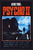
or perhaps the poster for Psycho II, which has two of the same elements as The Walking Dead: A lone person in the foreground and looming over him, a mid century century American house.
But there was something more to The Walking Dead poster, there was a classic quality to it, the composition, the color, the light and shadows, it seemed almost like a painting but which artist could have inspired this poster? The first person who came to mid was an amazing local artist by the name of Gabe Leonard
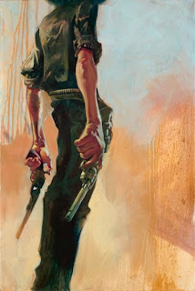
 |
| Gabe Leonard – “Crackshot” (Portrait of Bass Reeves) |
Gabe’s work ranges from the wild west to pirates to mobsters. His cinematic sense of light and shadow is incredible and his figures are wonderfully animated.
 |
| Gabe Leonard – “You’ll forgive me if we don’t shake hands” |
His paintings are a perfect balance of hyper-realism and expressionism from the fine details to the exaggerated hand, leg, arm and face proportions.
 |
| Gabe Leonard – “Calamity Jane” (He who hesitates is lost) |
So when I first saw the Walking Dead poster with the lone gunman’s lanky twisting pose, left leg tuked under his body and right arm dangling at is side, gun drawn, my first thought was “Nice! AMC is referencing Gabe’s work!”
I continued to think of where I had seen the elements of
the poster before, I thought back to all my art classes and introductions to artists over the years, then it struck me! It reminded me of a mash-up of some of the most famous mid century American painters who immortalized rural Americana landscapes. 3 of them popped instantly into mind.
1. Andrew Wyeth (Setting and Composition)
2. Thomas Hart Benton (Emotional Resonance)
3. Edward Hopper (Atmospheric Lighting)
I.
Setting and Composition
I can see the Andrew Wyeth inspiration for the poster right off the bat. Wyeth’s subject matter in his paintings centered around Rural American landscapes, his painting of “Christina’s world” (1948) is almost a template for the setting of The Walking Dead poster: the rural grassland, the sparse horizon, the tall mid century farm house off in the distance…
 |
| Christina’s World – 1948 |
Then there are paintings like “Public Sale” (1943)
 |
| Public Sale – 1943 |
which has the element of A rural road leading the viewer to something happening just beyond it
and “The Turkey Pond” (1944) which features the figure in the foreground moving with a sense of urgency, all aspects that can be found in The Walking Dead poster.
 |
| Turkey Pond – 1944 |
II.
Emotional Resonance
Thomas Hart Benton was a master of dramatic dark and light, more often known as “Chiaroscuro”. it is this quality that gives the Walking Dead poster it’s emotionally dark feel. Benton’s subjects were also mostly rural American areas. In his painting of “Martha’s Vineyard” (1925), the dramatically rendered sky and clouds as well as the “spot” lighting is clearly shown.
 |
| Martha’s Vineyard |
And in his piece” Approaching Storm” (1940), Benton visually describes the ominous sky wonderfully, he even has the darkness creeping in from the bottom corners. this use of Chiaroscuro is done very subtly in the Walking Dead poster, giving the viewer just a hint of bad things to come.
 |
| Approaching Storm – 1940 |
III.
Atmospheric Lighting
Edward Hopper is one of my favorite artists of this era. some of you might remember one of his famous paintings “Approaching the City” (1946) being defaced by Jack Nicholson’s Joker in the original Tim Burton “Batman” (1989) [ @ 0:45]
Hopper was a master of expressing light and color in a very real and visceral way. He captures the phenomena of afternoon and morning light in a very unique way. for example in his painting “Early Sunday Morning” (1930),
 |
| Early Sunday Morning – 1930 |
he captures beautifully the first moments of the rising sun hitting a building. The rich reds partially in shadow and the long shadows stretching across the concrete making the painting come to life! The lighting in the Walking Dead poster is very reminiscent of the lighting that Hopper used, the far off farm house echos the lighting of a church in his painting “South Truro Church” (1930)
 |
| South Truro Church – 1930 |
the lighting of the landscape in the Walking Dead poster has the feel of the landscape in his painting “Lighthouse hill” (1927)
Looks Familiar doesn’t it?
~CNIII


